
Designing a Patient Insights Dashboard
Role: Senior UX researcher and designer
Timeline: November 2025 — April 2026
What I did:
Led the UX design of a patient insights dashboard for doctors that used DIGITIVA to help treat their patients. This tool would enable doctors to make clinical decisions more efficiently.
Facilitated in defining user requirement specifications and prioritization to bridge the gap between product and business development. Prioritization shifted throughout the project to match discoveries and timelines.
Conducted concept testing with real users throughout the iteration process to ensure the interface aligned with user needs and preferences.
Built a design system with a large component library, tokens, and variables for seamless development, scalability, and consistent visual language.
The problem:
The doctors who were using DIGITIVA to treat their patients with heart failure were spending lots of time each day reviewing unfiltered PDF health reports that were being generated.
To continue increasing product adoption across their health systems, the doctors that partnered with DIGITIVA expressed strong feedback that we needed improve the method in which they received reports (automated emailed .zip folders) so they could be more efficient in their reviews.
The solution:
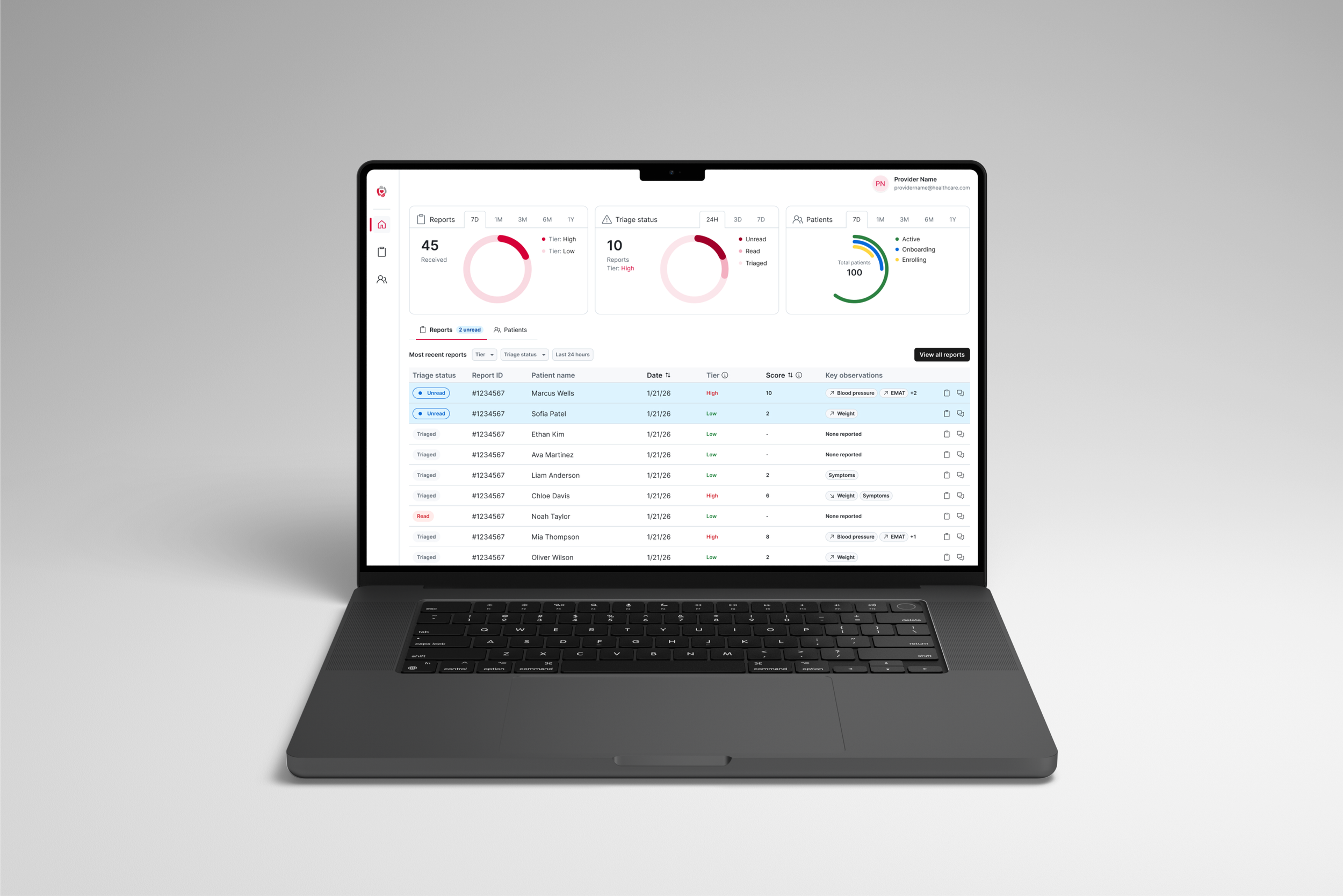
DIGITIVA Care Connect was a portal designed for doctors to receive, view, and share patient reports with more focus on the data that mattered most. We worked closely with users to craft this solution which could passively alert the doctors to reports that needed urgent review, ultimately cutting the costly time spent reviewing the majority of reports that had no clinical actionability.
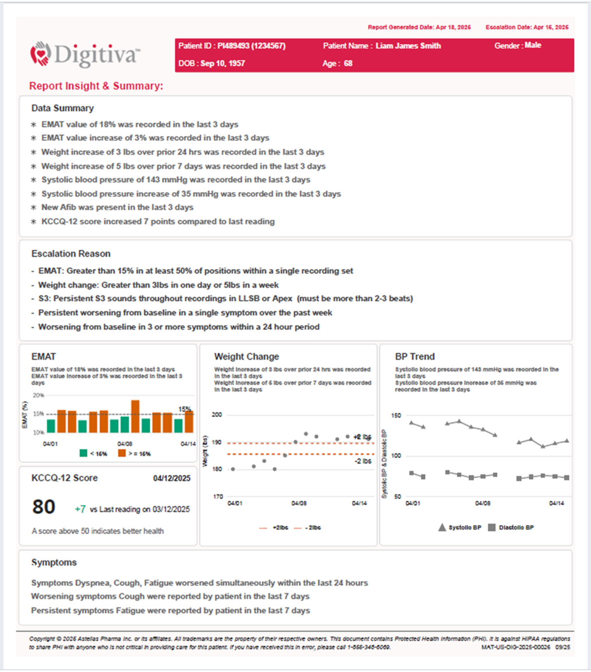
Example of a DIGITIVA remote monitoring report that doctors would receive every three to seven days containing patient health trends and information.
DIGITIVA generated reports on patients’ heart failure disease progression by aggregating user reported symptoms and heart recordings into individualized reports every three days and seven days.
Doctors reviewed every report that came in for each of their patients (which could be dozens a day) and found that only a small minority of those reports resulted in a clinical action such as medication changes.
Background
Defining the problem
In our recurring meetings with doctor using DIGITIVA, several key pain points in their workflow were consistently coming up:
Doctors spent over an hour every day reviewing patient reports individually for signs of worsening heart failure and wanted this process to be more efficient.
Searching the automated emails that contained daily reports in a .zip folder was a clunky user experience and led to an unorganized process with inefficiencies.
Health systems were often assigning just one doctor to review all of the reports due to the delivery method, creating a bottleneck in patient treatment.
Though the DIGITIVA team had recently updated the design of the reports to be easier to review by emphasizing key patient findings, doctors still had difficulty with the overall volume. After conducting three user interviews and weekly informal conversations with doctors, I created a problem statement.
Problem statement:
How might we increase the efficiency of reviewing daily DIGITIVA reports by surfacing key details and reducing friction between the users and accessing reports while maintaining the doctors’ autonomy over patient diagnoses and oversight?
Settings requirements and brainstorming
We evaluated the competitive landscape and surfaced two viable solutions to address our problem statement: data integration with electronic health record systems (EHRs) or developing a custom web portal.
After cross-functional conversations with product managers, operations, software development, and external stakeholders, we decided to develop a custom web portal to meet development timelines and user needs. We would plan to integrate our portal with EHRs further down the product roadmap.
From there, we wrote user stories to help define the user specification requirements and task flows.
User Stories (acceptance criteria not shown)
User story 1
As a doctor treating DIGITIVA patients, I want to receive and view reports in an online portal so I can see them without downloading .zip folders.
User story 2
As a doctor treating DIGITIVA patients, I want to filter out reports that don’t show concerning trends so I can spend less time reviewing reports every day.
User story 3
As a doctor treating DIGITIVA patients, I want to import reports into my EHR directly from the online portal so I can keep track of patient records across platforms.
Once we had a clear direction for user needs, I began creating task flows and sketching low fidelity wireframes. I aligned with our stakeholders and created a medium fidelity prototype to do some rough evaluation and testing with our users.
In our rough testing with this prototype, we discovered two key user needs that doctors described:
Sharing reports within the portal: Users wanted to be able to get second opinions or send reports to non-primary doctors to review when the primary was not available.
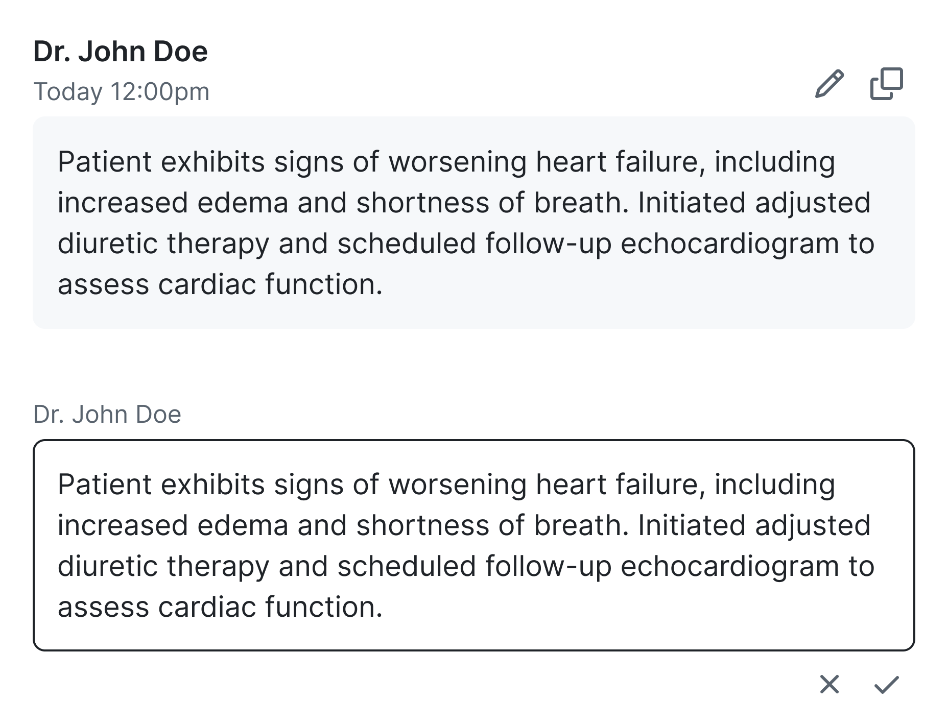
Securely copy notes from the portal to their EHR: Users wanted to type notes directly into the portal during reviews but have an ability to quickly and securely copy them into their patient records.
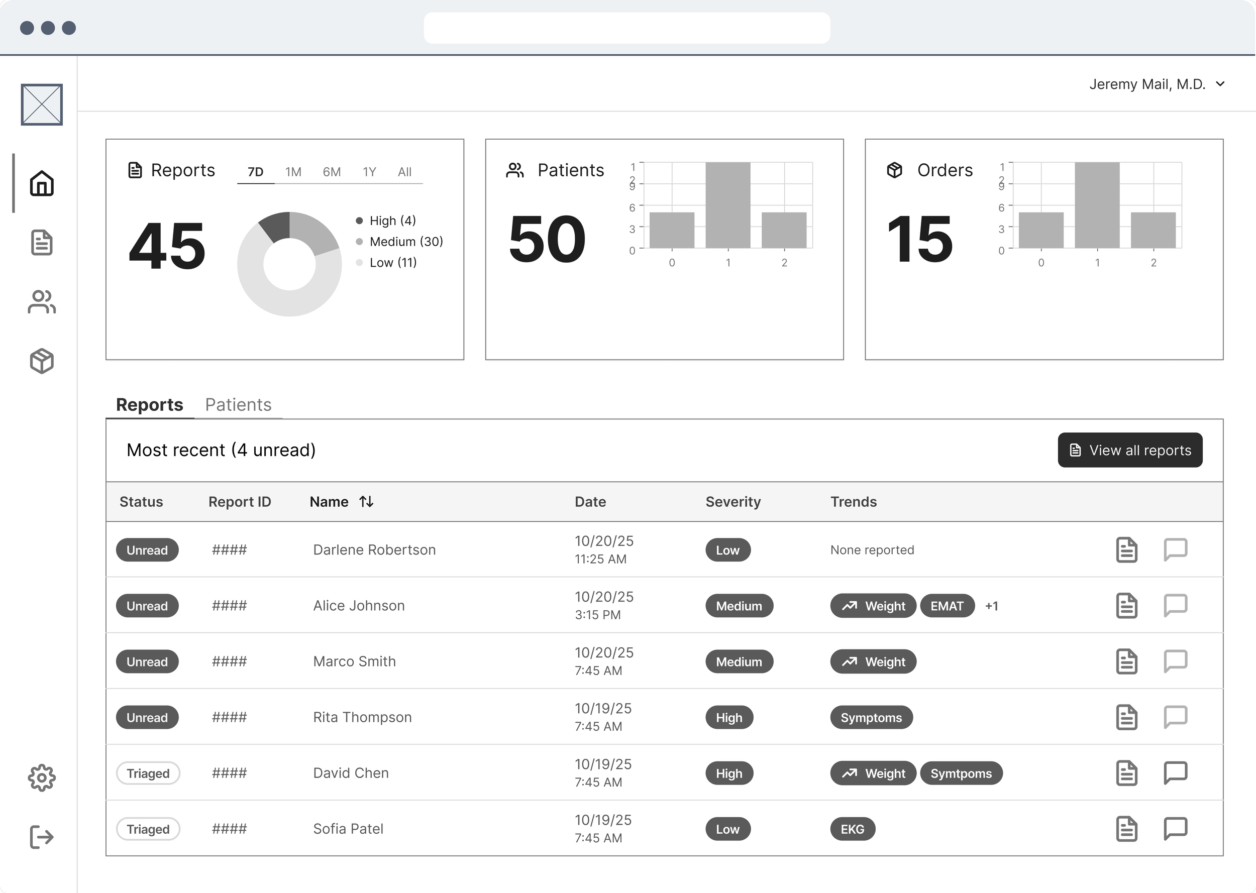
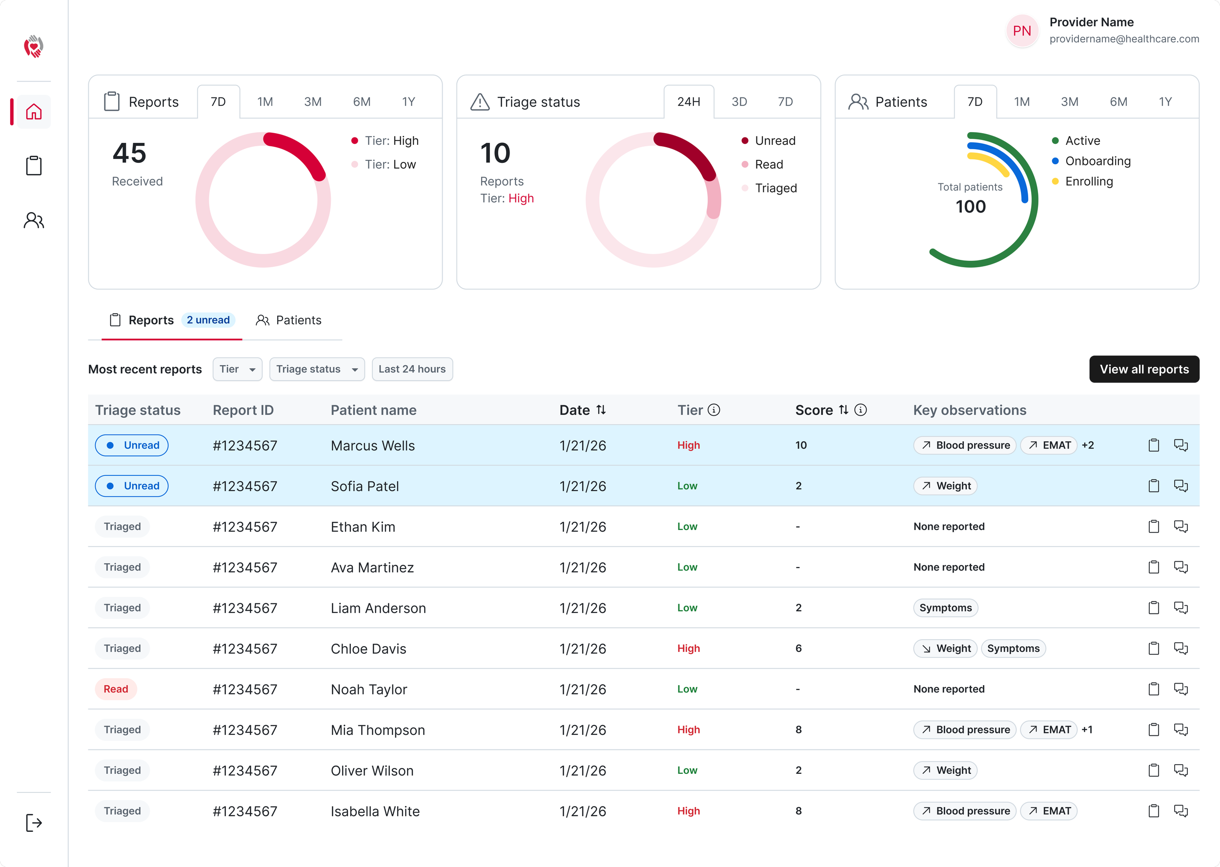
I played with ideas for a dashboard-style homepage, with different options about what analytics doctors would find most valuable and different list views like most recent reports and patients. In conversations with doctors, they wanted to be able see breakdowns of reports and patient statuses.
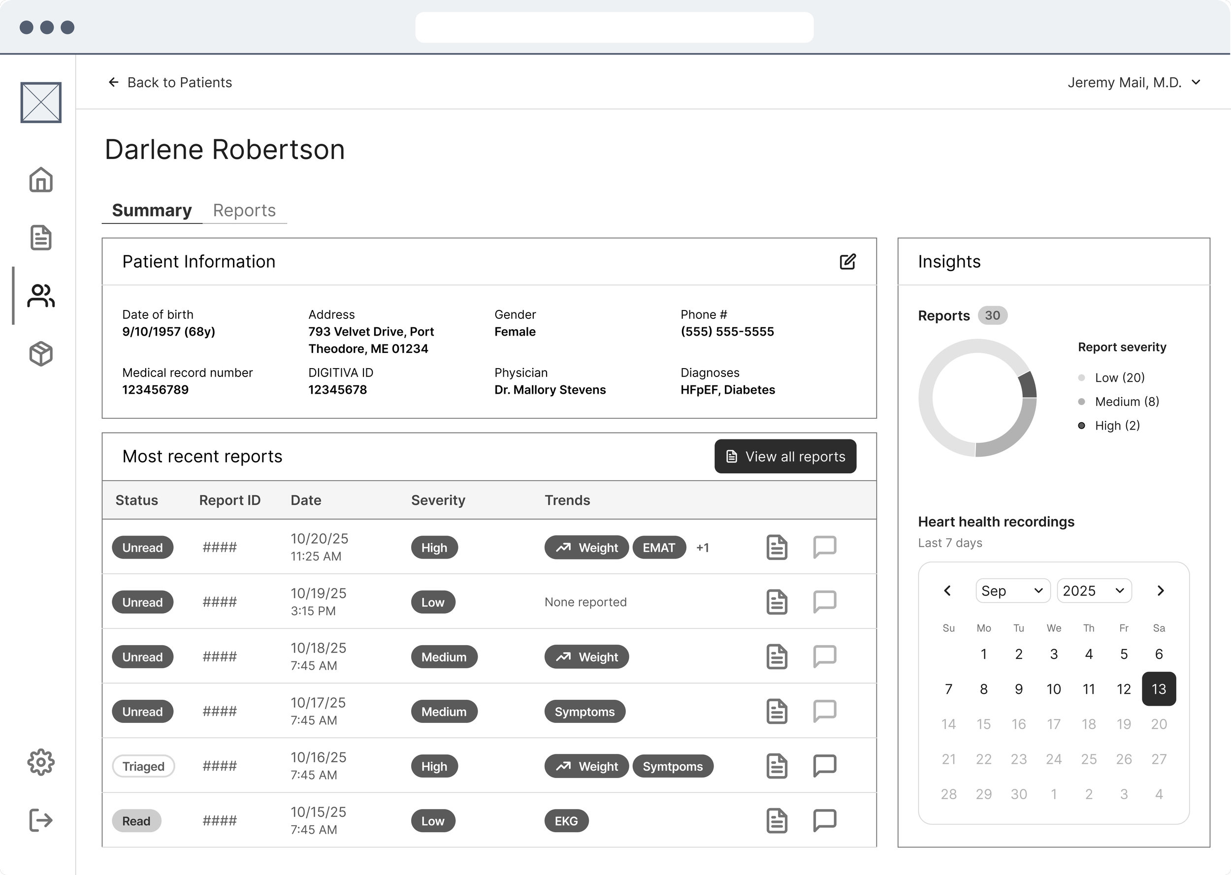
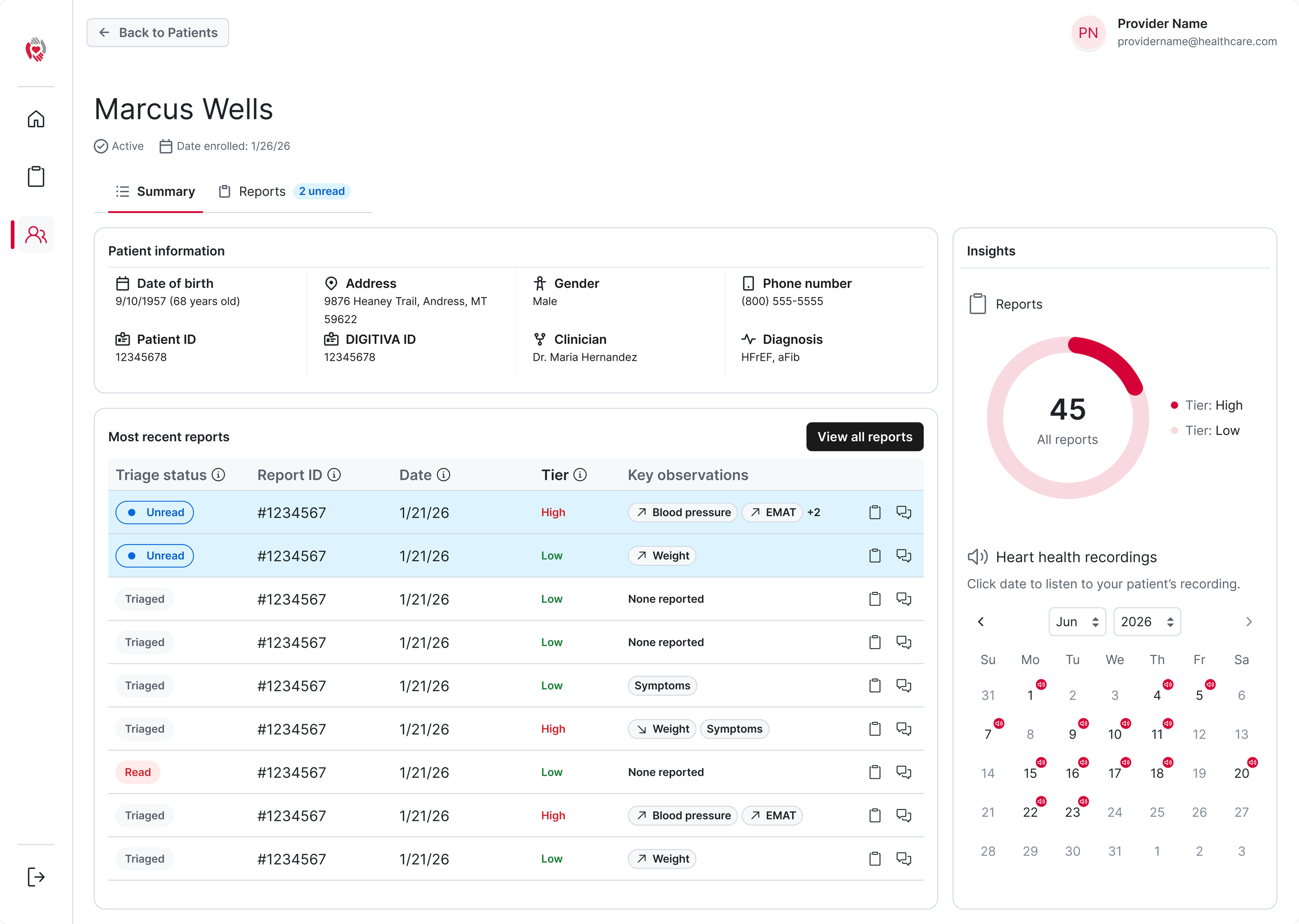
We heard from doctors that they would pull up reports for patients who were in the office with them through their EHR. I brainstormed wireframes for an individual patient dashboard that would provide more in-depth analysis for doctors than their EHRs could surface.
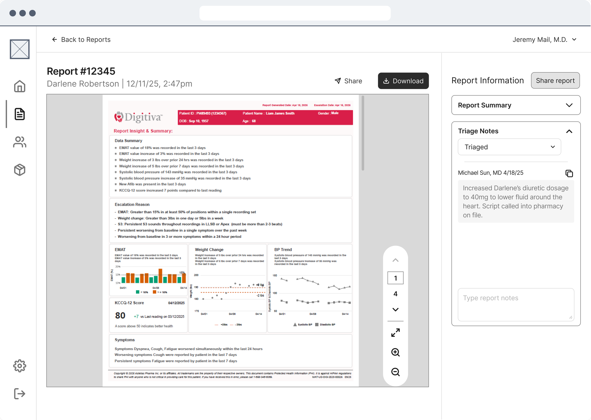
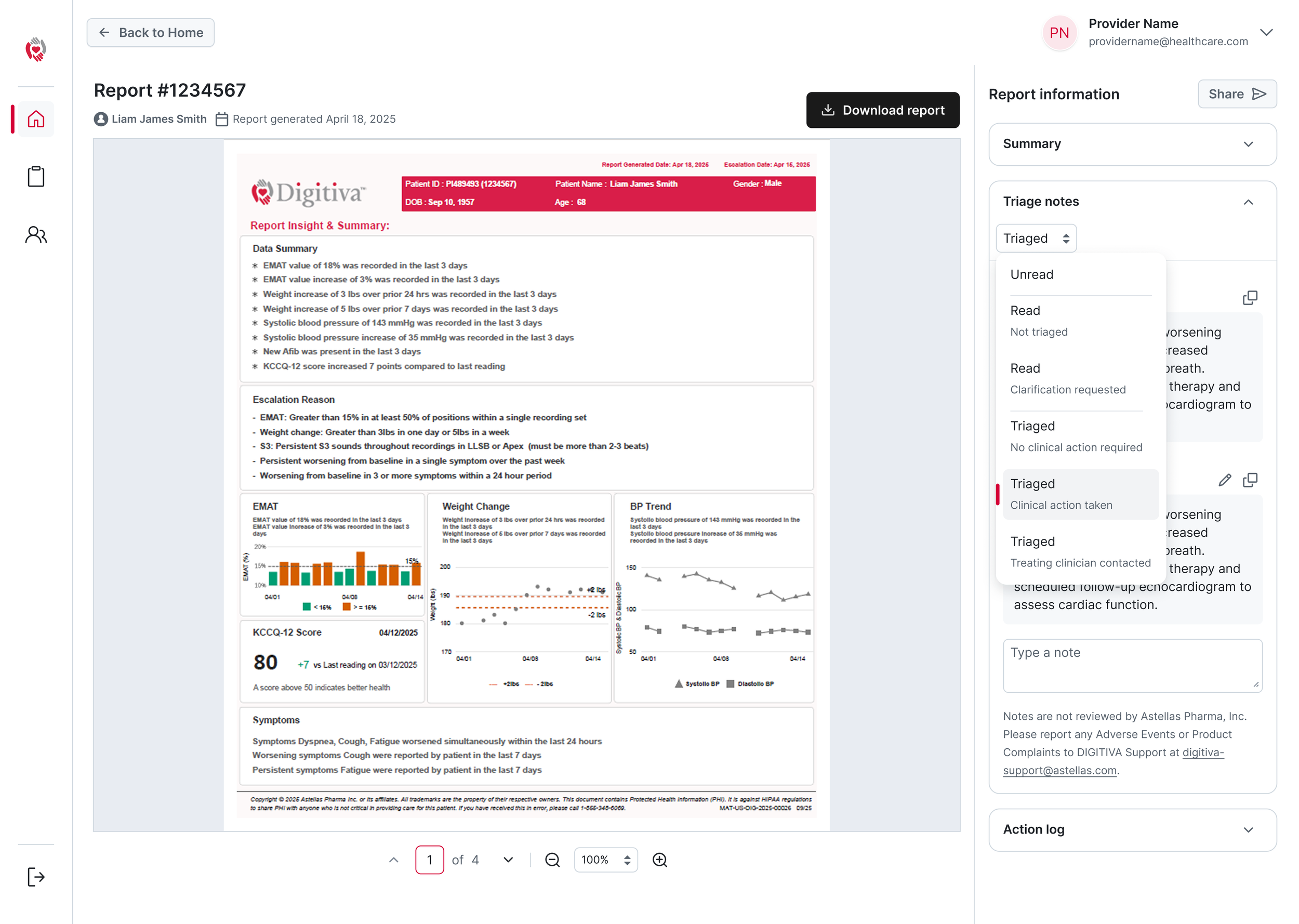
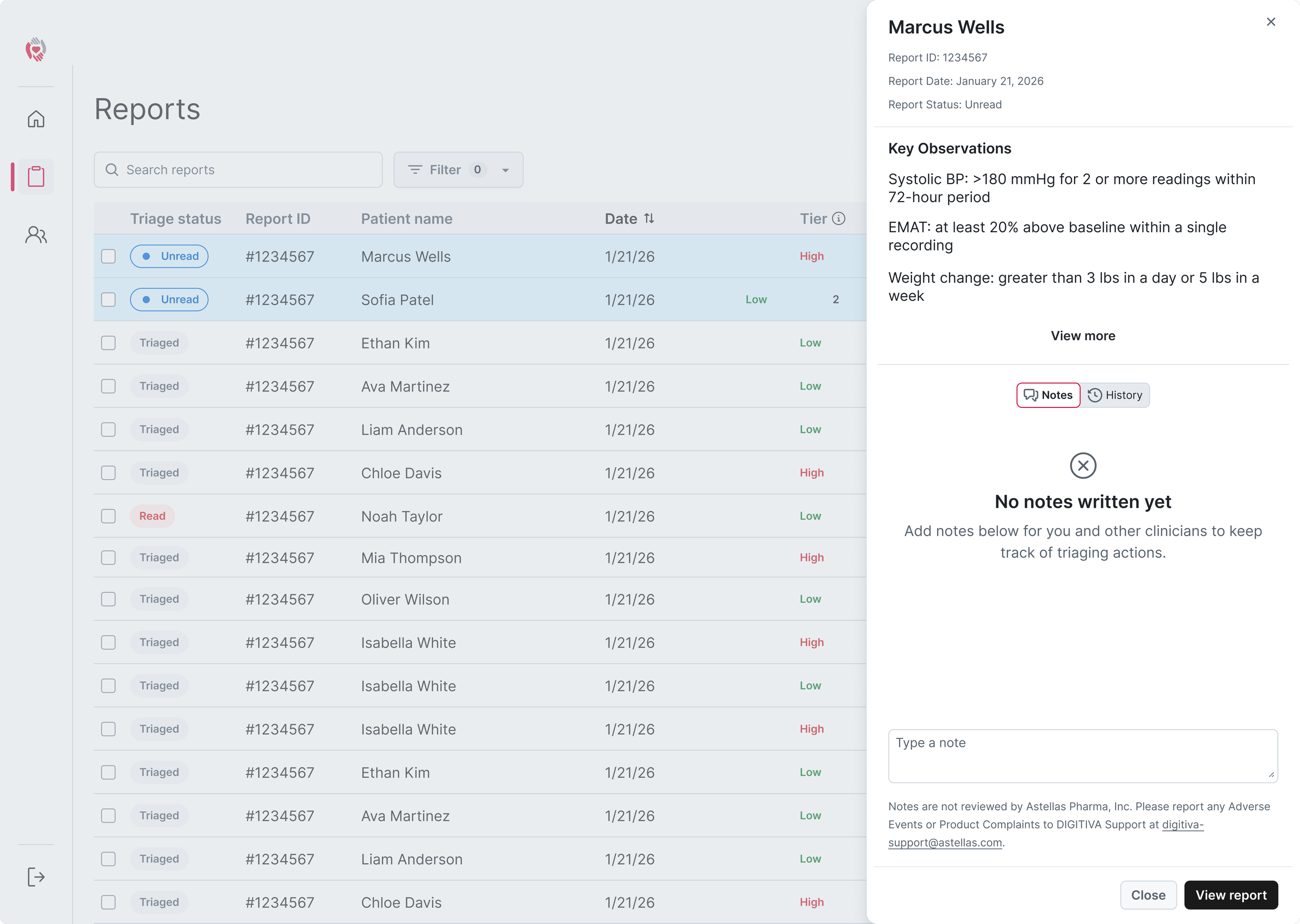
By selecting a report from a list view, doctors would be able to view the PDF version of the report that they were used to getting in .zip folders. From this view, we wanted doctors to be able to change that status of reports (such as whether or not it had be triaged) and add any notes they may have from their review.
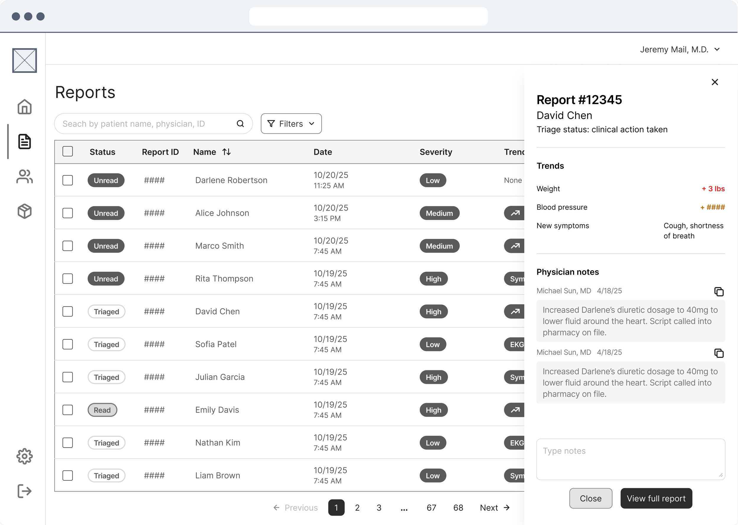
One of the ways we brainstormed making reports easier to review was to surface metadata like trends and symptoms in the “Reports” view along with a dialog quickview. We also spoke with our medical advisors to assign severities to each report so patients with higher priorities health trends could be priortiized.
Creating a design system
I proposed creating a design system to our product team prior to moving from medium to high fidelity. This was for several reasons; we planned to scale DIGITIVA across mobile and desktop and bring more of our design language in-house, build out more robust features as part of the product roadmap, and ensure consistency for developers and future designers on the team.
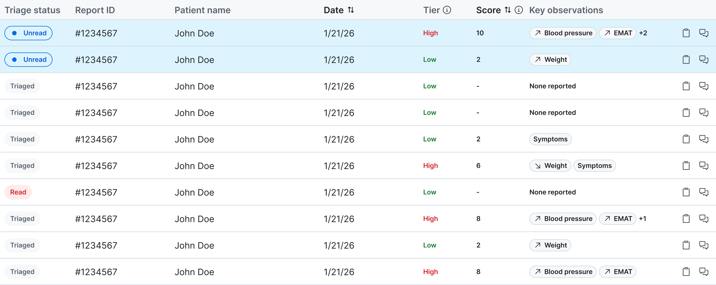
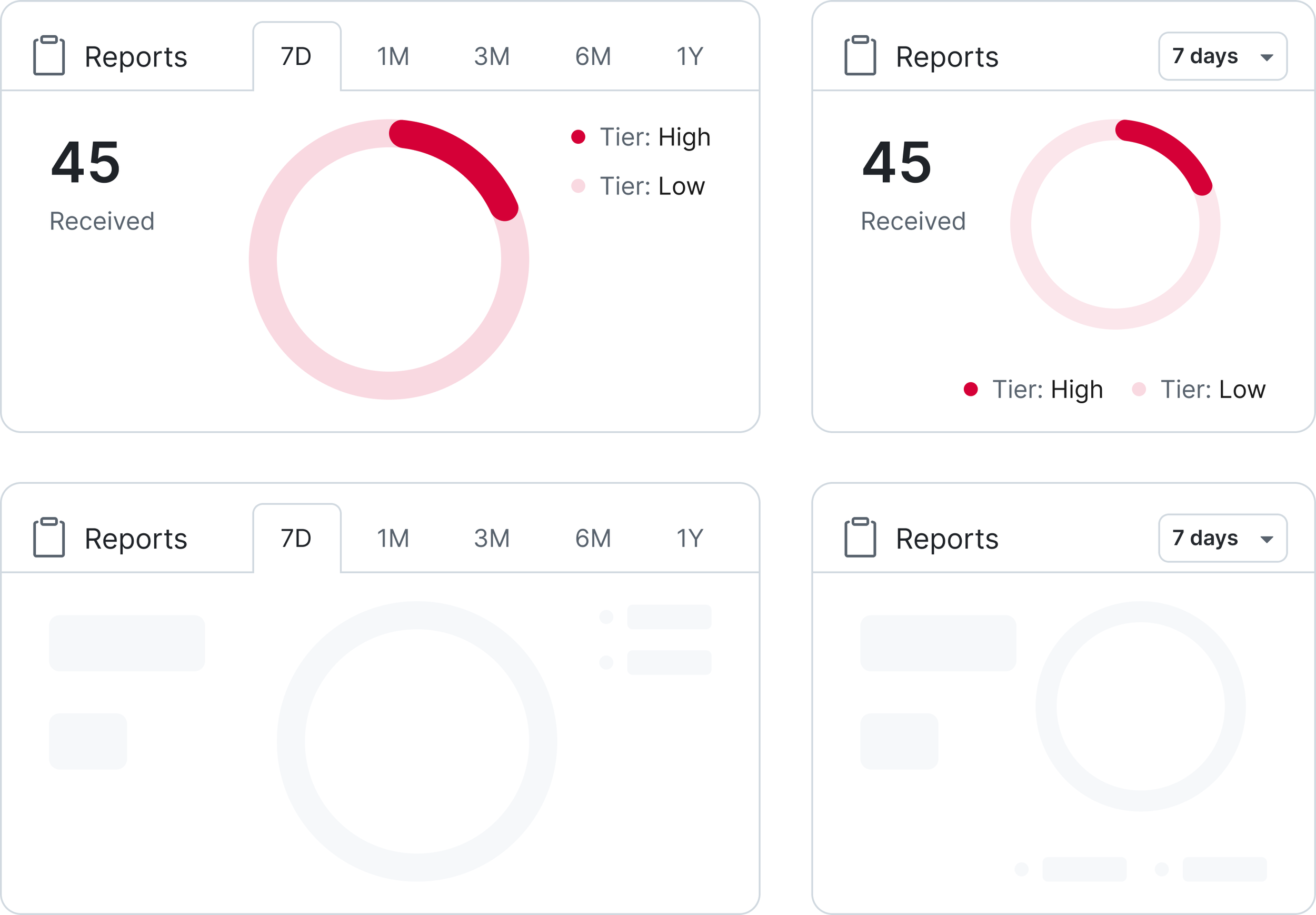
Instead of building from scratch, I opted to theme our design system off of Github’s open source Primer system after auditing its alignment with our accessibility needs, components, and design language. Below are some key components I created with breakpoints, variables, booleans, and nested components.
Component
Data Table
Variables
Size: Widget, Expanded
Nested components
Column Header Cell, Label Cell, Text Cell, Action Cell
Component
Data Widget
Variables
Size: Expanded, Collapsed
State: Normal, Loading
Data: Reports, Patients, Triage Status
Nested components
Header, Graph, Text Cell, Text Label
Component
Doctor Comment
Variables
State: Entered, Editing, Copied, Other User
Edited? (Boolean): Yes/No
Nested components
Form Label, Text Input, Actions
High fidelity implementation
After evaluating the medium fidelity prototype with our stakeholders and developing a design system, I updated the user experience to align with the user needs. From there, I skinned the wireframes with the design system and annotated the file to handoff to our developers.
One other use case we considered near the end of development was if the doctors have closed out of the portal or have it running in the background, how do we encourage or remind the user to review important reports that may have come in since their last session?
To solve for this, we designed a daily digest email and a shared report email template.
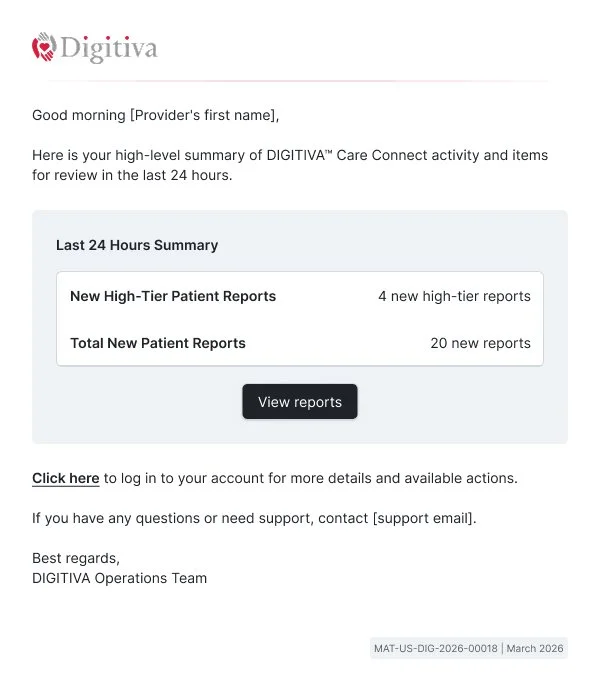
Daily digest email template
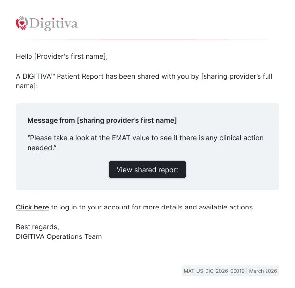
Shared report email template